


They have been referred to, colloquially, as the “’Stormers” for several years.
Now it is official.
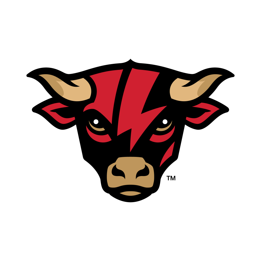
The Lancaster entry in the Atlantic League, known as the Lancaster Barnstormers since their inception before the 2005 season, will now be known as the Lancaster Stormers, it was announced today by team management. A modernized logo has been introduced for the 2024 season as the club enters its 20th year.
“Coming off back-to-back championship seasons and entering our 20th year, we thought this would be the perfect time for updated branding,” said General Manager Mike Reynolds.
The agricultural theme will not at all be retired. Cylo will remain the Stormers mascot, an everyday presence at the stadium and in the community. The Stormers will continue to wear a “barn” patch on uniform sleeves and it will be a bull logo carrying the club into the future. This brand refresh is inspired by the rich history of the club’s past while storming forward into the future. As an identity that has been relatively unchanged since the club’s inaugural season in 2005, an opportunity existed to bring a fresh look – and face – to the brand. Likewise, the overarching purpose of this project was to modernize the overall look and introduce a character that could activate in a number of dynamic ways to generate fan excitement, expand merchandising opportunities, and provide inspiration for thematic gameday activations.
Once we established the answer to our ‘why’, the rest of the creative process was about having an open mind and sharing ideas. The new identity needed to feel authentic to both the agricultural roots of the region as well as the forward momentum and modern essence of Lancaster.
While change was the premise of the job, it was important to retain existing equity where it made sense. For example, the colors are still red, black, and gold, and the iconic script L mark remains. However, shortening the nickname to Stormers was a natural evolution of the brand, signaling a new era and placing emphasis on a more powerful theme.
Through the process, the bull emerged as the ideal character for the club. Everything from roosters, to rams, to horses, weathervanes and even tractor combines were explored before landing on the bull – strong and determined with a bolt of lightning across its forehead. Two iterations are included in the logo package to provide application flexibility – a straight-on head mark and a profile version charging through a barn. The bull is complemented with modern lettering, a custom font inspired by Pennsylvania Dutch calligraphy.
The final package is a reflection of a true team collaboration. Just like the bull, Stormers opponents will be seeing red in 2024.
To create its new identity, the club partnered with SKYE (sdsbranding.com), a national leader in sports branding.